
When The Huntington National Bank unveiled a bold brand refresh, it signalled a new chapter in its nearly 160 years of history. As expected with a legacy this long, a refresh can’t be about change for the sake of change, it has to be purposeful.
At its heart, the refresh is about evolving alongside customers, helping them live confidently today while preparing for tomorrow. From its visual identity to its products and digital experiences, Nikia Reveal, Huntington’s chief brand officer says the bank is positioning itself as a trusted partner, guiding people through every stage of their financial journey.
More than a redesign, it’s a reflection of Huntington’s commitment to meet customers where they are, support their goals and redefine what modern banking can be.
The case for a refresh
At its core, Reveal says the brand refresh was driven by an aim to evolve alongside people as their lives, priorities and expectations change. As customer expectations of banks shift rapidly, the brand needed to move in step with the business to meet people where they are today, not where they were in the past.
In particular, research from the bank showed that many customers are focused on living well in the present without compromising their future security. They want flexibility, balance and reassurance that enjoying life now does not come at the expense of long-term stability.
“They want to spend smartly and enjoy their lives without guilt over everyday choices like a morning coffee,” she says. “We wanted to build a brand that supports that mindset, one that celebrates abundance, however an individual defines it, and the craft of managing money in a way that helps achieve that feeling.”
That sense of evolving with customers also extends beyond the individual. The research revealed that many people are not only managing their own finances, but also supporting others whether that’s an ageing parent, a teenager, or someone dealing with illness or addiction, according to Reveal.
As a result, the brand refresh ran in parallel with a broader product evolution as the bank developed new offerings designed to reflect the realities of customers’ lives today.
This focus on meeting customers where they are explains not only the direction of the refresh, but also its timing. The rebrand was designed to support where the business itself is heading.
“This was the right moment because Huntington is growing beyond its legacy footprint and expanding nationally,” she says. “As we introduce ourselves to people who may not know the brand, it was important to do so in the most authentic and compelling way, while also setting the business up for long-term success.”
Timing also played a role. It had been some time since Huntington’s last major brand overhaul, and the world – and the expectations placed on brands – had moved on significantly. Accessibility, in particular, has become far more central.
“Accessibility considerations such as American with Disabilities Act (ADA) are far more central today, and we wanted to be sure the brand was modernised to reach all people, on all platforms, in a meaningful and inclusive way,” she says.
Where tradition meets modernity
While the brand refresh was deliberately forward-looking, focused on defining where the bank is today and preparing it for the future, Reveal also had to balance that ambition with Huntington’s nearly 160-year history.
Rather than a constraint, Reveal describes that balance between longevity and evolution as a “wonderful challenge.”
“Huntington has a deep and inspiring history, and everything we did was rooted in elements that are authentically Huntington,” she says. “We wove that heritage throughout the work while intentionally designing for how people live today.”
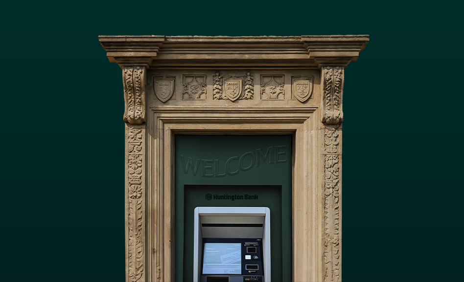
That balance is most clearly seen in the visual identity. The refreshed colour palette was designed to feel both classic and contemporary, combining the bank’s deep, dark green, known as ‘Prosperous Sage’, with ‘Abundant Green’, a brighter and more energetic shade that adds a modern edge.
“Together they create a distinctive and ownable visual identity,” Reveals says. “Those colours are also a thoughtful ADA pairing, with enough contrast that even customers who are red/green colourblind can distinguish them.”
Typography follows the same principle, she adds. ‘The Huntington Serif’ is a custom typeface inspired by the styles of the bank’s founding era and the lettering carved into its original branch architecture.
Yet, a modern sensibility is introduced through dynamic layouts and its pairing with ABC Monument Grotesk, which is highly readable across digital platforms while still feeling warm and human.
The new brand in action
To bring the brand refresh to life, Huntington launched the ‘Let’s Get More from Money’ campaign alongside it. The campaign was built on the idea that banks have a responsibility to use their expertise to help everyone unlock their full financial potential.
Reveal says the campaign aimed to reframe money from a purely utilitarian tool into a craft that customers can develop and master.
This ties directly to the purpose of the brand refresh: people want and need more from their finances today, and the campaign reminds them that a bank can be more than a place to store money because it can also be a trusted partner offering guidance and advice.
“Money is something you can get better at over time, and Huntington is a place where that craft can be supported and developed. “Let’s Get More from Money” is our way of communicating that shift in mindset,” she says.
Designed for extreme localisation and personalisation, the campaign used a modular creative approach with interchangeable visuals, voiceovers and animations.
This allowed the team to scale the campaign across channels, regions and audiences while keeping a cohesive brand identity.
For example, in Charlotte, a native speaker was used for the voiceover to reflect the bank’s local presence and attention to community nuance.
“That approach mirrors how Huntington does business, with local leadership, local talent and local decision-making,” Reveal says. “The brand genuinely reflects the way the business operates.”
She adds that the in-house brand team were also key because they enabled Huntington to activate the campaign quickly, consistently and authentically across channels as the bank grows nationally.
This approach ensured that every execution across channels, regions and audiences felt authentic, grounded in the communities the bank serves and aligned with the promise to help customers get more from their money.
In this way, the campaign doesn’t just communicate the refreshed brand, it also brings it to life in a way that is practical, personal and distinctly Huntington.
Financial marketers and communications leaders who have delivered standout work in the US market are encouraged to enter the Financial Promoter Awards USA 2026, entries open until 10 April.
This story appeared in Issue 15 of the Financial Promoter magazine. To be one of the first to read it, subscribe here: Subscribe – Financial Promoter